An Oxblood Kitchen, a Hidden Diner Reference, and a Closet That Used to Be a Bedroom
Luxury renovation in West Village, Manhattan, NY. Waverly Place, Greenwich Village. Interior design by Maggie Richmond Design. Photography by Kirsten Francis.
A landmarked 1928 cooperative on Waverly Place. Two bedrooms. Original metal cabinetry still in the kitchen. Blue linoleum countertops. Not renovated in decades, possibly ever.
Of all the luxury renovations in West Village, Manhattan, NY that we've taken on, this one had the most specific brief, developed by Maggie Burns of Maggie Richmond Design with her client (a fashion retail marketing executive), called for a London townhouse aesthetic dropped into Greenwich Village. The reference point was specific: if Elizabeth James from The Parent Trap moved to New York, this is what her apartment would look like. Rich oxblood in the kitchen. Muted chocolate browns and warm neutrals throughout. An English countryside mural in the foyer. A second bedroom converted entirely into a walk-in closet and home office.
That's the vision. Our job was to figure out how to build it inside a pre-war co-op where the board prohibits structural modifications, the walls are plaster on lath, and every trade has to work around 97-year-old building systems that were never designed to accommodate any of this.
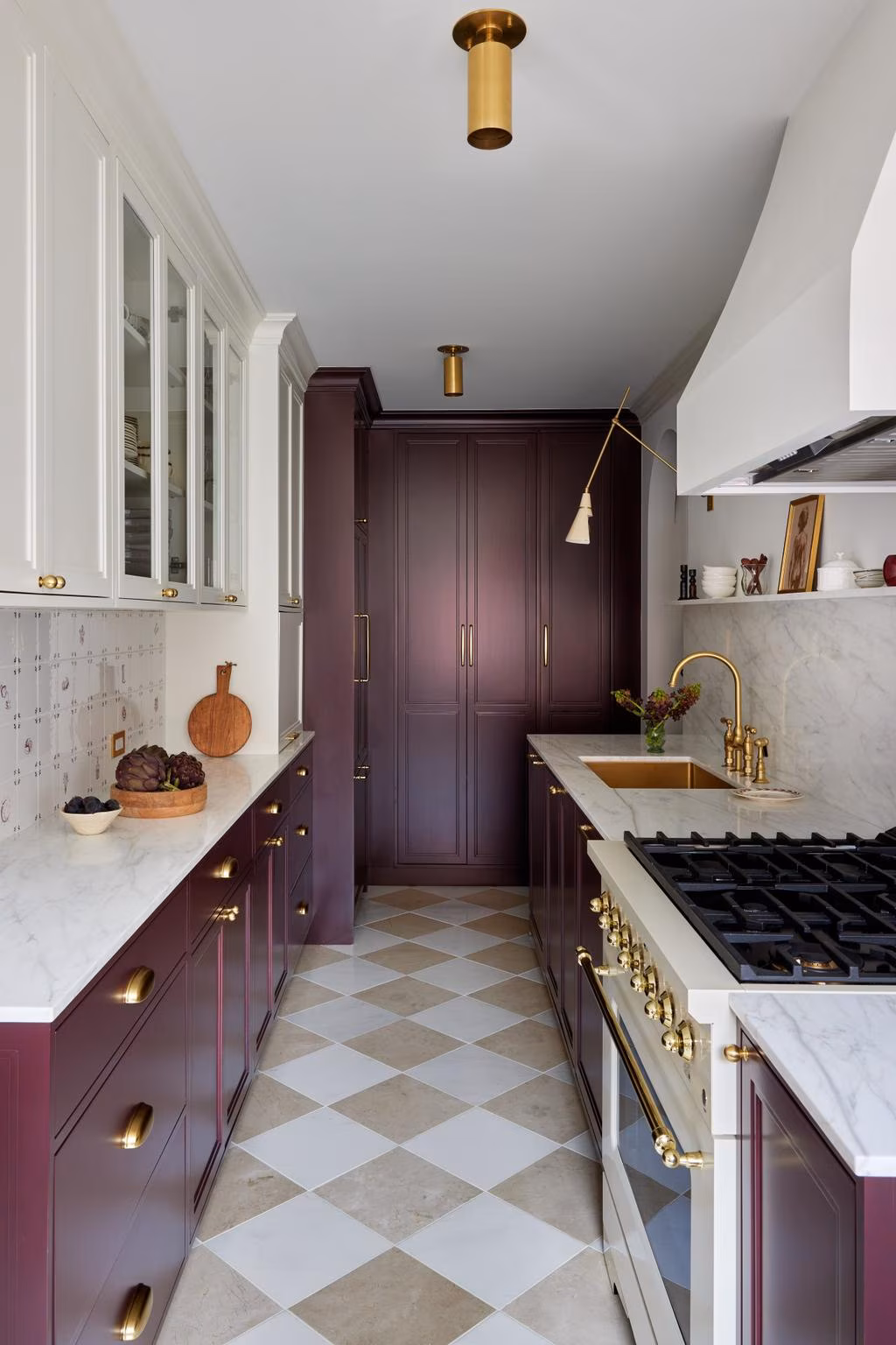
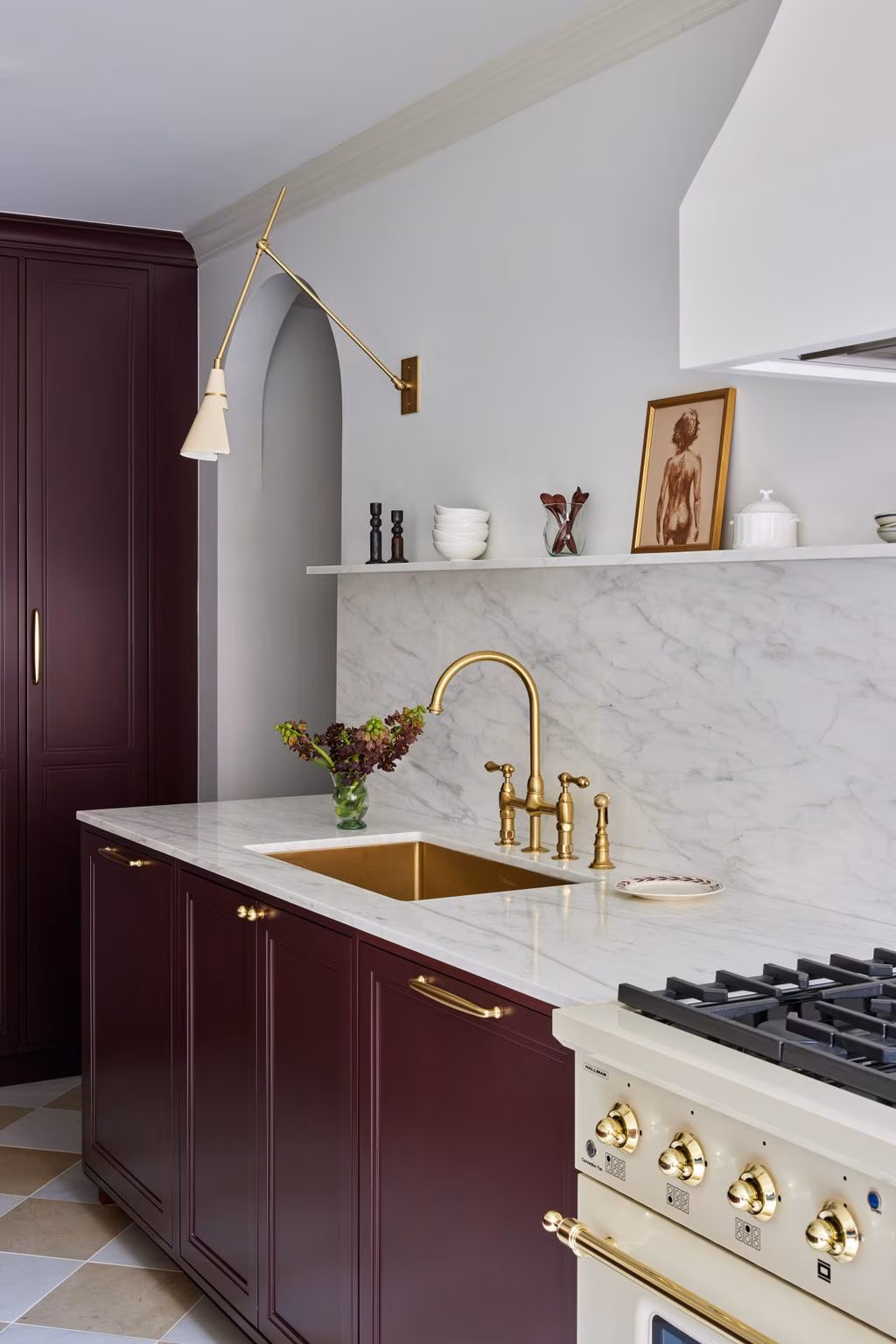
The Kitchen
The design called for oxblood cabinetry. Getting that color right in lacquer is harder than it sounds. Oxblood sits on a narrow band: shift too red and it looks like a 1950s diner; shift too brown and it looks muddy. We produced multiple lacquer samples in our Yonkers workshop, each sprayed on the actual substrate and evaluated under the apartment's specific lighting conditions, before the final color was approved. The cabinetry was then fabricated, finished, and delivered as complete assemblies.
The backsplash presented a different kind of precision problem. The design specified hand-painted Delft tiles by UK artist Petra Palumbo. Each tile is a one-of-a-kind piece, which means slight variations in dimension, glaze thickness, and surface profile. Our tile setters had to treat these like artwork, not commodity tile. The layout was planned to ensure visual continuity across the full wall. Every grout line had to be consistent despite the dimensional variation between pieces. One cracked tile during setting would have meant weeks waiting for a replacement from the UK.
We also built an appliance garage into the upper cabinetry, a concealed compartment behind hinged doors that stores every small countertop appliance the client owns. That detail came out of our pre-construction process: before design even started, we inventoried every item the client planned to bring into the apartment and designed storage around the actual objects, not estimated dimensions.
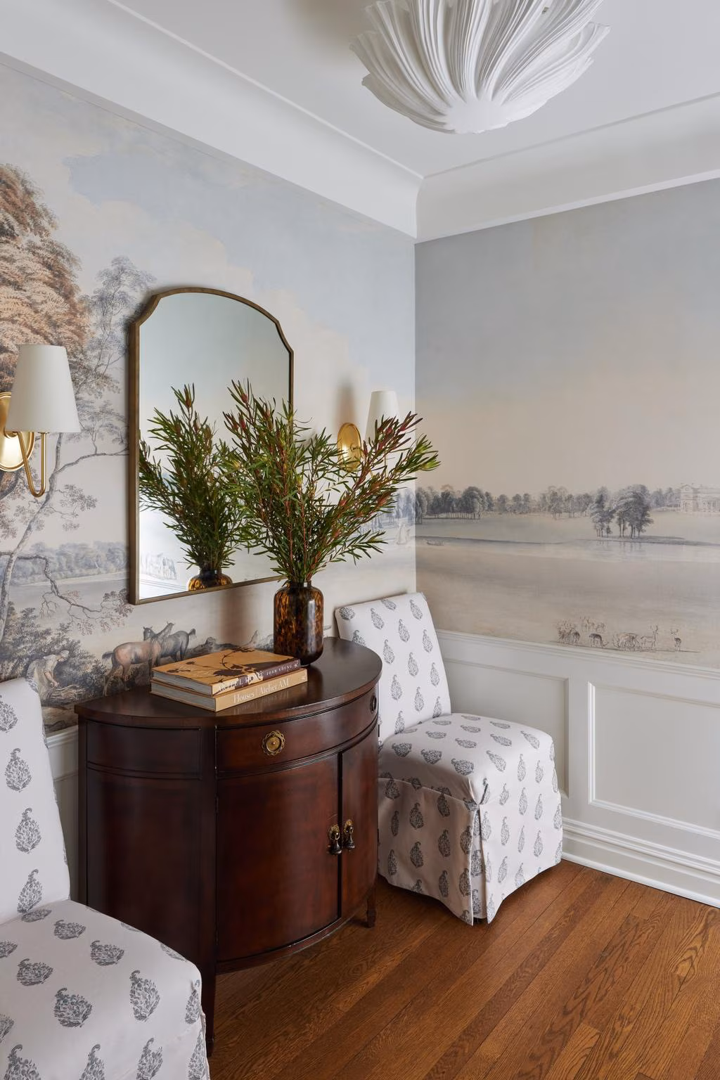
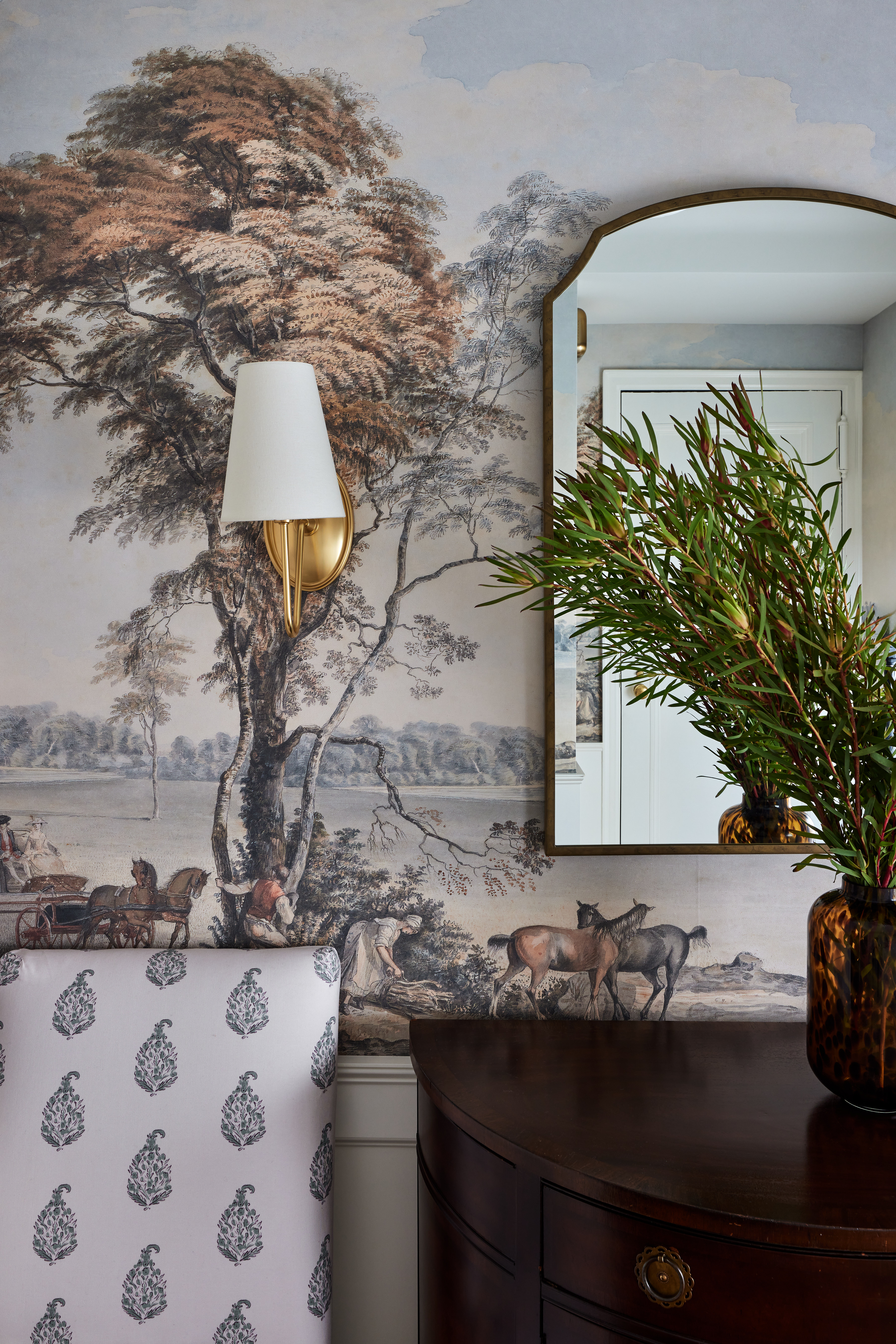
The Foyer
The design called for a full-wrap English countryside mural in the foyer. The build challenge was coordination. The mural panels had to be hung on walls that were first repaired, skim-coated, and sanded to a Level 5 finish, because mural paper shows every imperfection underneath. The built-in coat closet in the foyer is lined with wallpaper that coordinates with the mural, which meant our millwork team had to deliver the closet carcass to exact dimensions before the wallpaper installer could confirm alignment. If the closet was off by even a quarter inch, the pattern wouldn't match at the seam between the closet interior and the foyer wall. We built the closet, test-fit it, delivered final dimensions to the installer, and then removed it so the mural could go up on a clean wall. The closet went back in after the paper dried.
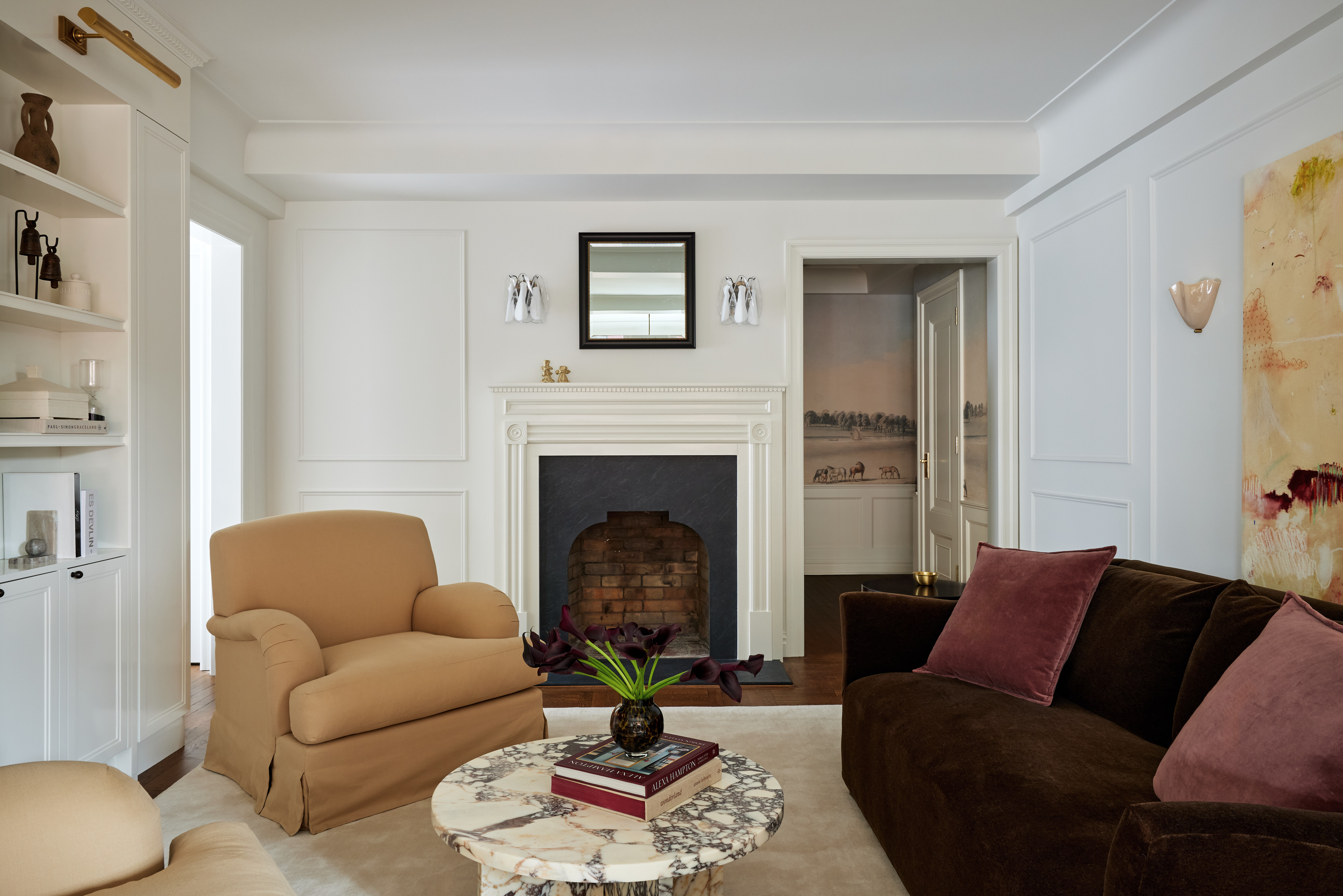
The Floors and Moldings
The original parquet floors were in solid condition. We stained them espresso rather than replacing them, which saved material cost and preserved the dimensional stability that only decades of curing can produce. New parquet would have needed a full acclimation cycle and still might have moved seasonally in ways the original wouldn't.
The crown molding and wall paneling throughout the apartment are entirely new. We added every piece. The design required them to look like original 1928 details, which meant the profiles had to be period-appropriate, sourced from a mill that could match the proportions common to pre-war Manhattan co-ops. Corners were coped, not mitered. Mitered joints look sharp on install day but gap as the building moves seasonally. Coped joints accommodate that movement and stay tight. The paint finish was built up in multiple coats to the point where the molding reads as plaster, not wood. That distinction matters in a building where every neighbor's apartment has actual plaster moldings from 1928.
We also built and hung all four interior doors: solid core panels with low profile bolection moulding and Grandeur Fifth Avenue hardware in polished brass. The window trim uses Dykes Lumber casing with bullseye rosette corner blocks at every window, a period detail that most renovations skip because it requires precise wood blocking behind the wall. Every door, trim, and rosette was painted to match the new crown molding so the apartment reads as one continuous architectural language.
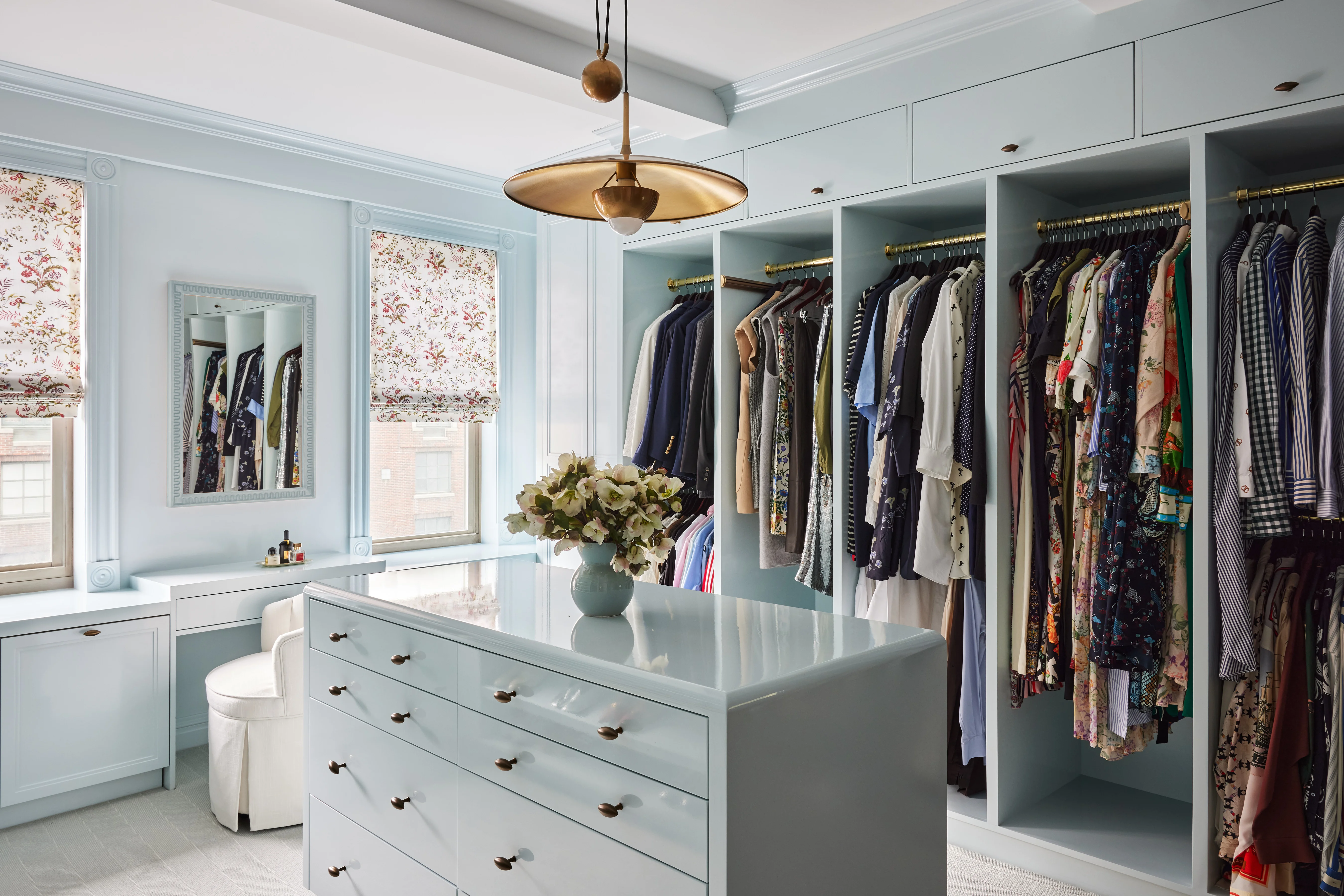
The Closet Room
Converting a bedroom into a dedicated closet and office is a design decision. Building it to the standard this project demanded is a construction problem.
The millwork is high gloss lacquer in soft powder blue. High gloss lacquer is the most unforgiving finish in residential construction. Every dust particle, every orange-peel texture, every uneven coat is visible. You can't sand it out after the fact without re-spraying the entire panel. We sprayed every component in a controlled booth environment at our Yonkers shop, then wrapped each piece individually for transport. On-site installation was done with cotton gloves. No bare hands touched a finished surface.
The wardrobe island in the center of the room has custom jewelry drawer inserts: divided felt-lined compartments sized to specific pieces the client owns. The hanging rods, shelving heights, and drawer depths were all dimensioned from a physical inventory of the client's wardrobe. Not rough estimates. Actual measurements of actual garments, shoes, and accessories. The window treatments (Brunschwig & Fils, Chancay print) and wall-to-wall carpet were cut and bound to the room's exact dimensions after the millwork was installed, not before, so that the fit between soft goods and built-ins would be seamless.
The Plumbing and Electrical
Every pipe and wire in this apartment is new. Running new MEP through a 1928 co-op is slow, precise work. The walls are plaster on wood lath. You can't route cable or pipe the way you would through modern stud walls. Plaster cracks when you cut it. The lath behind it splinters. And the co-op board's restriction on structural modifications meant we couldn't open walls from the other side or create new chases.
Our electricians and plumbers worked in planned sections, accessing wall cavities from locations where built-ins would later cover the access points. We used flexible PEX tubing for water lines wherever possible, which reduced the number of joints and fittings behind finished walls and allowed us to route around obstructions that rigid pipe couldn't navigate. Every penetration was mapped in advance and coordinated with the millwork drawings so that nothing ended up behind a panel that might need to be accessed later.
The work is invisible. That's by design. No visible patches, no cracked plaster, no evidence that the walls were ever opened.
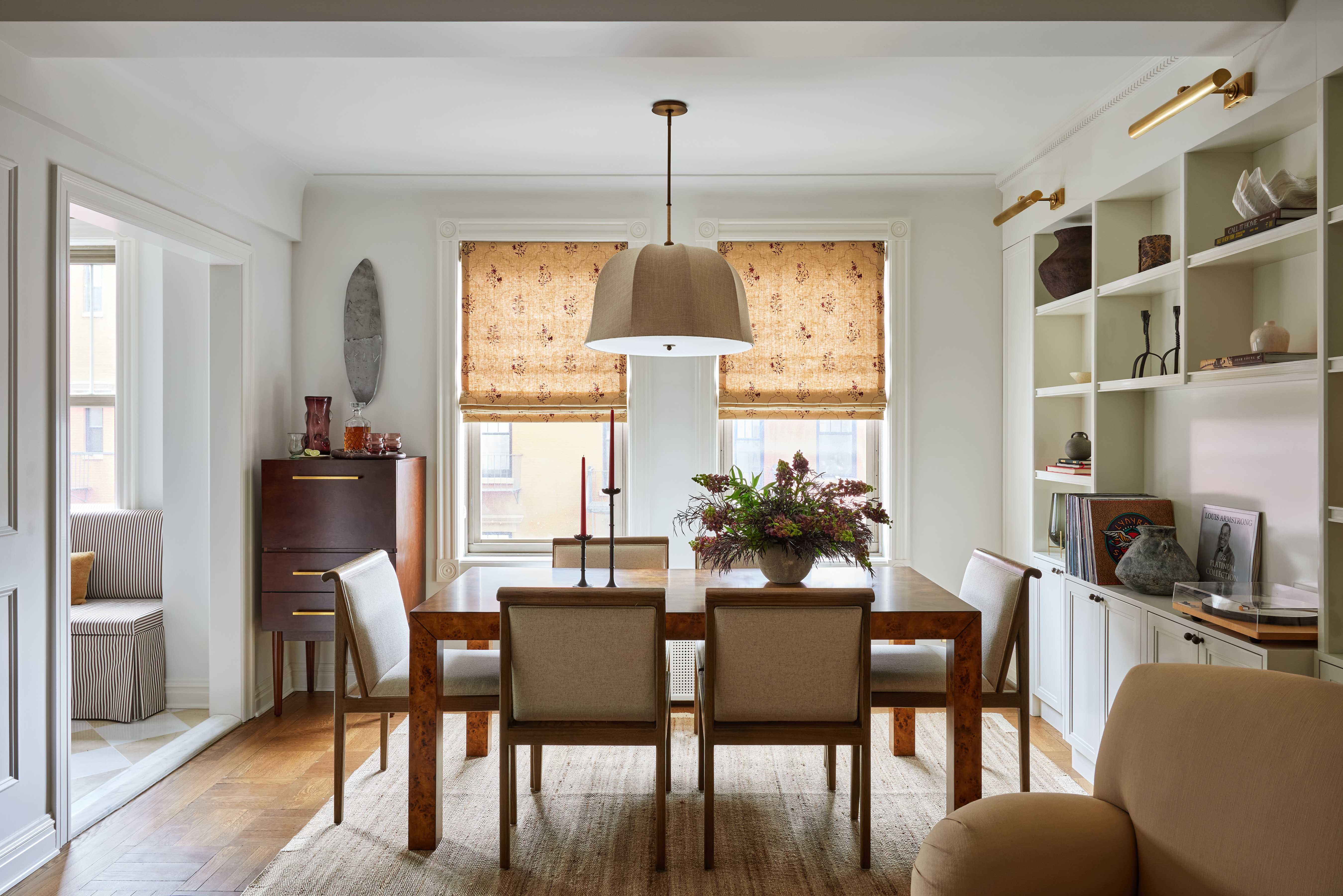
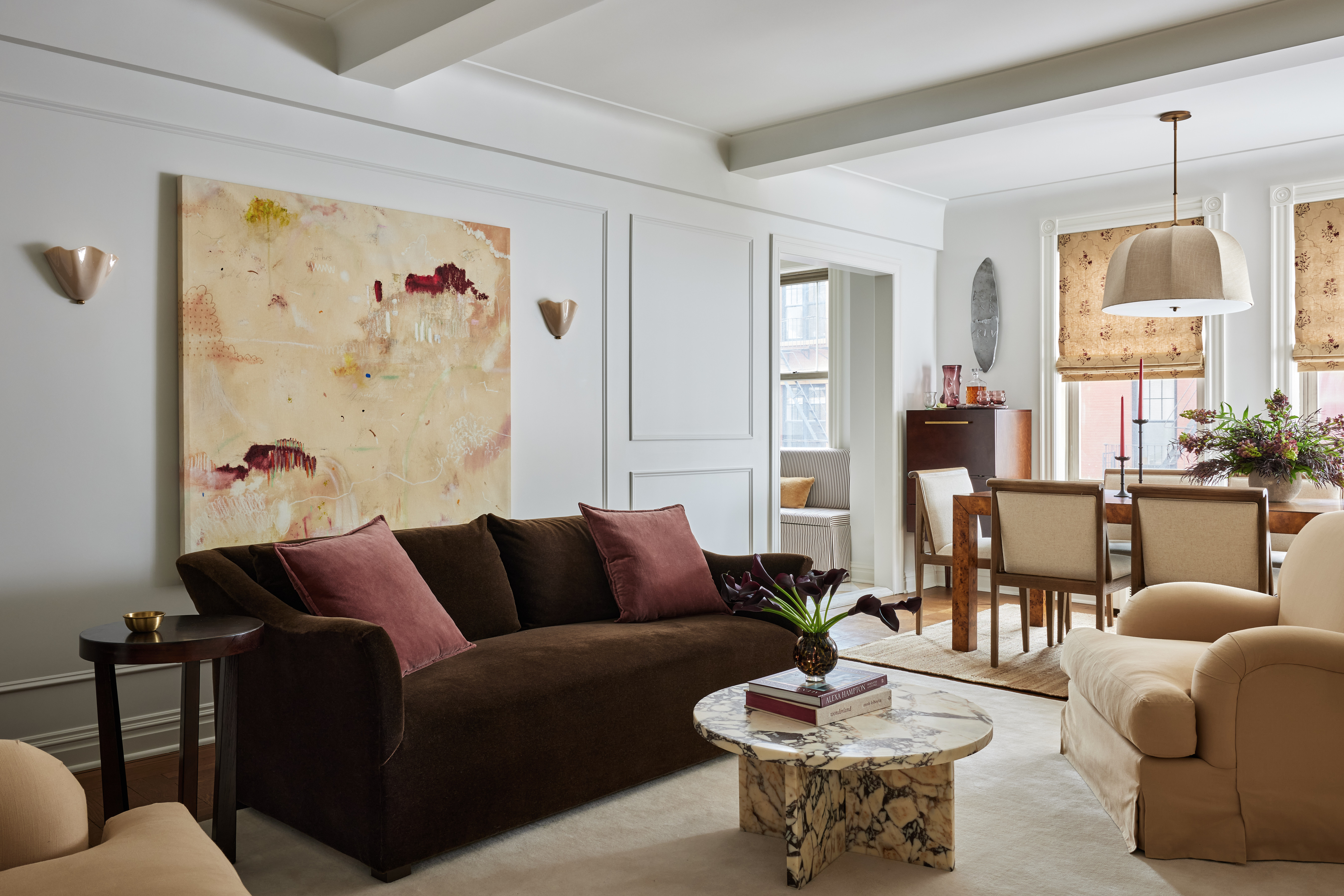
The Living Room
We built a custom millwork bump-out in the living room specifically to house the client's record player. One object, one location, one height, with cable management routed behind the panel and a ventilation gap so the amplifier doesn't overheat. It required its own shop drawing. That's the level of specificity this project operated at: every built-in was designed for a named object, not a general category.
The apartment also features a commissioned artwork by Canadian artist David Wilstermann, who created the piece using fabric swatches and material samples from the project so that the colors tie directly to the interiors. There's a small "open 24 hrs" painted into the canvas, a reference to the Waverly Diner across the street. It's a detail that connects the apartment to its exact address on Waverly Place.
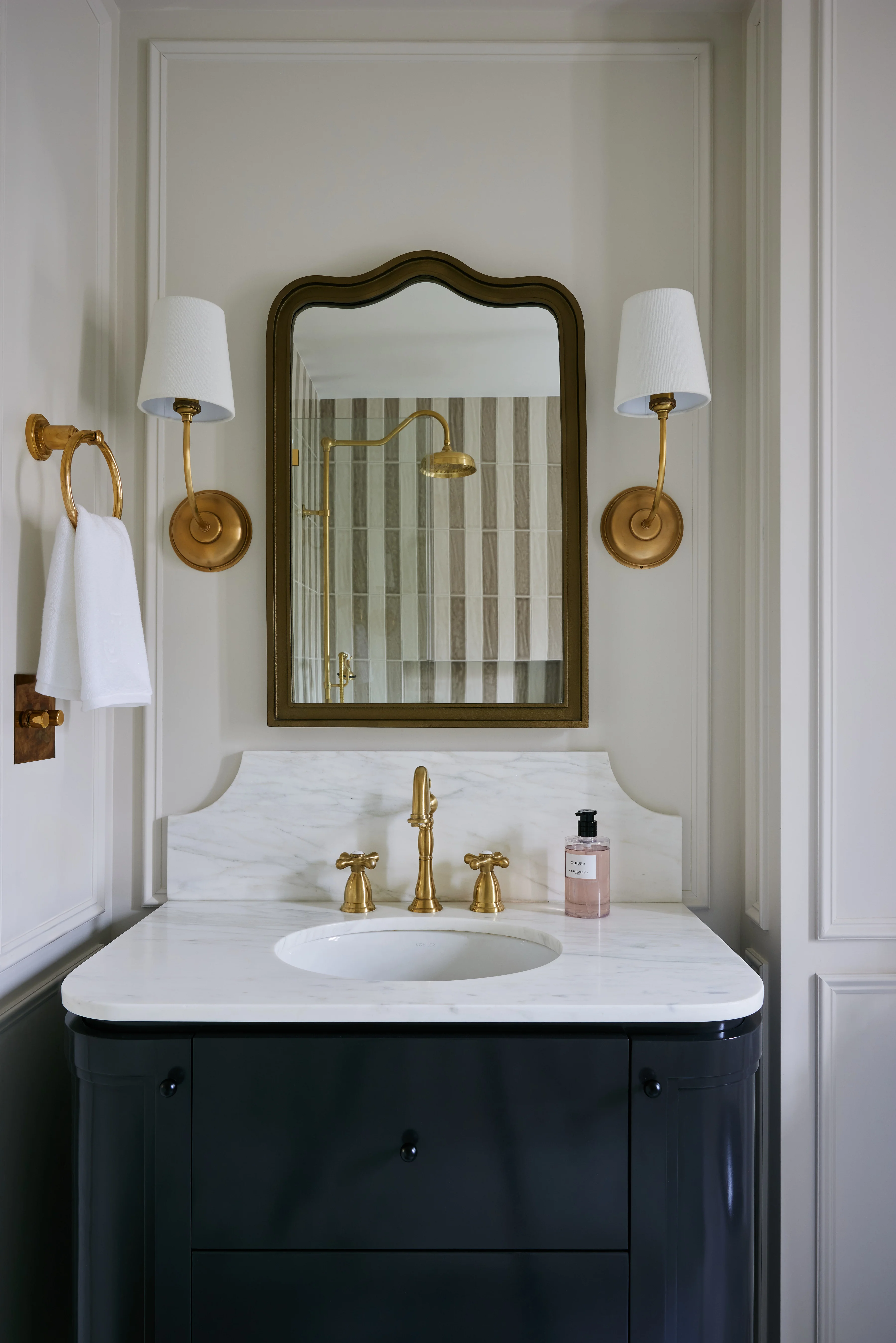
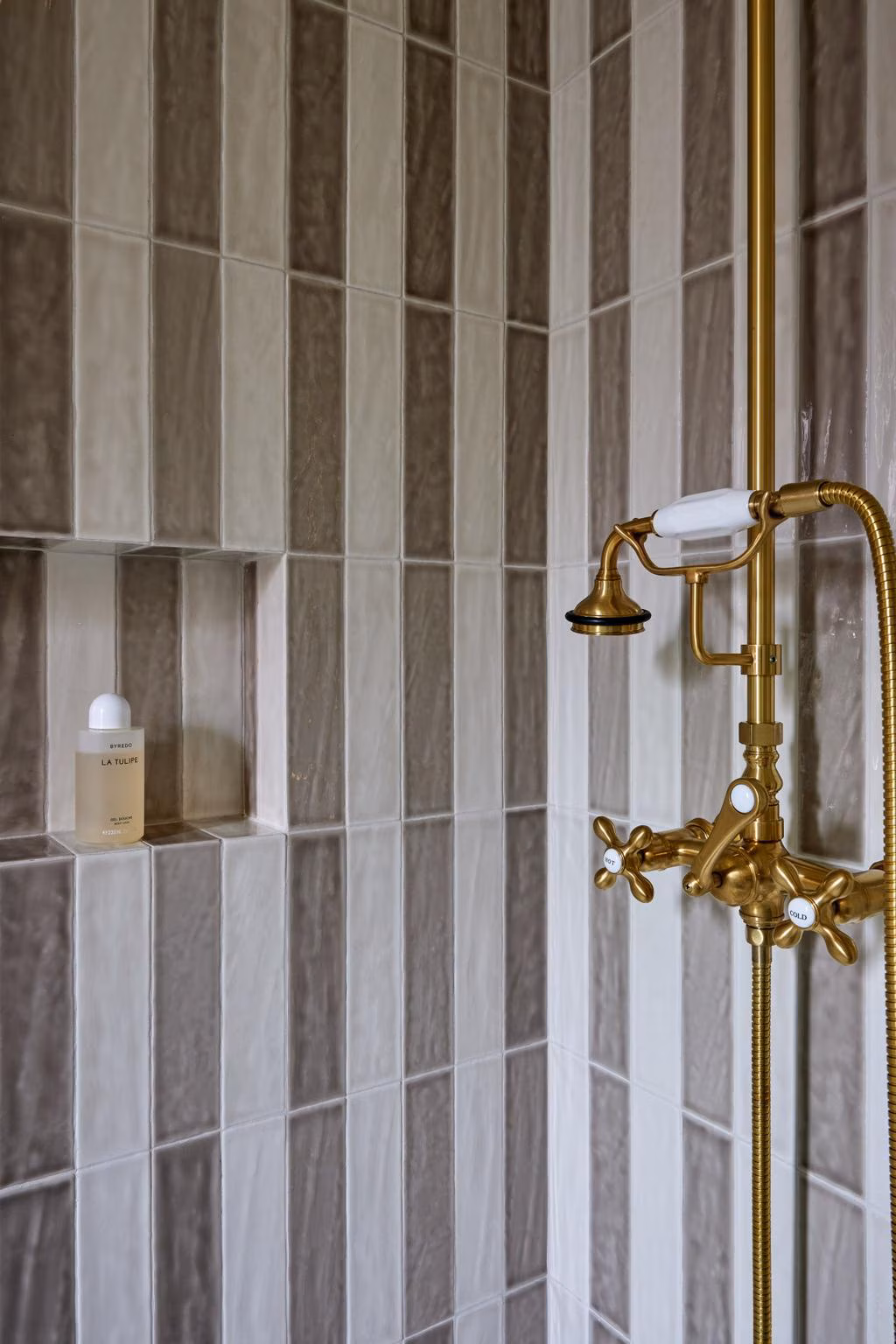
The Bathroom
We gutted the bathroom to studs and rebuilt it completely. Waterproofing was a Laticrete system with full coverage on all wet surfaces, flood-tested for 24 hours before any tile was set. In a pre-war co-op with wooden floor joists and neighbors directly below, waterproofing failure isn't a warranty claim. It's a six-figure liability that damages multiple units. We don't set tile until the membrane passes.
The tile layout was planned on paper, dry-laid on site, and adjusted before setting. In a small bathroom, there's nowhere to hide a bad cut or an asymmetric edge. The starting point of the pattern was shifted so that cuts at the perimeter would be equal on both sides. The vanity was built to the room's exact dimensions in our shop, not ordered from a catalog. There are no filler strips between the vanity and the walls because the vanity was made for this room and no other.
What Doesn't Show Up in Vogue
The Vogue Australia feature, photographed by Kirsten Francis, captures Maggie Burns' design exactly as it should be captured: the oxblood kitchen, the powder blue closet, the countryside mural, the hidden diner reference in the Wilstermann painting. It's a beautiful apartment and the design earned that coverage.
Behind what the magazine captured, there's another layer to this project. The plumbing and electrical threaded through 1928 plaster without cracking a wall. The Laticrete waterproofing under every tile in the bathroom. The controlled-environment lacquer spraying on the closet panels. The sequencing that put the foyer closet in, took it out, let the mural go up, and put it back. The coped crown molding that will still be tight against the wall ten years from now. The shop drawing for a single record player shelf.
That's the work. And it's the reason the beautiful things on the surface will still be beautiful in twenty years.
View the full project gallery →
Project Credits
- Type: Luxury Renovation in West Village, Manhattan, NY
- Project: Waverly Place Apartment, Greenwich Village
- Building: Landmarked cooperative, built 1928
- Completed: March 2025
- Interior Design: Maggie Richmond Design (Maggie Burns)
- General Contracting & Custom Millwork: CooperBuild
- Key Collaborators: Petra Palumbo (Delft tile), David Wilstermann (artwork), Brunschwig & Fils (textiles)
- Photography: Kirsten Francis
- Press: Vogue Australia, June 2025
Subscribe to Our Newsletter
Get the latest insights, trends, and news from the construction industry delivered straight to your inbox.
We respect your privacy. Unsubscribe at any time.